CNN: Cracker Barrel stock tanks after unveiling a controversial logo change
This Cracker Barrel controversy doesn’t make any sense to me. Coincidentally, that puts me in agreement with Cracker Barrel’s target market.
This can’t be about the change in logo. The new logo kept the only good aspect of the old logo. Both logos use a nice serif font and have the ‘C’ engaged with the ‘B’. Everything else about the old logo is terrible.
My brother says that I make provocative statements and that aesthetics are subjective, so here are my objective reasons.
Old Country Store:
- The font is too small to read from a distance.
- CB is primarily a restaurant, not a store.
- What is an “old country store”? Back in the day, a general store in a rural area would have a small selection of necessary products. CB has a selection of entirely superfluous knickknacks.
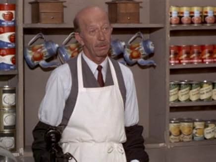
Perhaps they are going for a general store atmosphere like Mr. Drucker had on Green Acres, Fine, but calling it an old country store is too on the nose. Like calling something “Ye Olde” anything.

The Guy in the Chair:
- The image is too detailed to be presented in a two-color illustration.
- Why is the guy crossing his legs like a woman? Was CB queer-coded the entire time?
- Nobody who eats at CB can cross their legs like that.
- The crossed legs gives him odd, reversed feet.
General Features:
- What is the shape behind the CB text? Is that a butter bean?
- Why does the ‘k’ engage with the butter bean?
- The butter bean is too small for the CB text.
The old logo needed an update. The new logo is too bland to be offensive for any reason other than the lack of effort that went into it. I hope Cracker Barrel doesn’t pay for marketing.
The logo is not controversial. Cracker Barrel is being hammered for progressive corporate policies. The company had to have been coerced, because it isn’t plausible that CB could attract a wide following of queer customers.
Let’s go through the queer stereotypes.
Gay men are fit, stylish and meticulous. Those attributes are off-brand for CB, where they serve comfort food in a frumpy and cluttered environment.
Lesbians are artsy and creative. Again, off-brand for CB.
Trans people try to look like the opposite sex or something in between. CB is already there for them. Get old enough and fat enough, and everybody has breasts and haven’t seen their genitals.
To get credit for supporting progressive causes, a company has to get flamboyant and activist. Cracker Barrel’s brand is dull and inactive. Their old logo was just two shades of the same color and featured a guy sitting down.
Cracker Barrel must be in desperate financial trouble to pander to progressives. It won’t help. They need competent management who understand marketing.
The Cracker Barrel brand is comfort food served in a comfortable environment. That should be an easy sell. Black, White and Hispanic people get old and like food. Queer old people aren’t demanding rainbows and gender neutral bathrooms, they want to sit down and tuck in to a good meal. Just like the rest of us.
It’s a shame. Whatever incompetence got Cracker Barrel this far down the drain, isn’t about to dummy up and change course. Neutral companies like John Deere and Tractor Supply dropped DEI before having a public crisis. Poor Budweiser. They didn’t know they were playing with fire, and somehow thought that everyone was down with the struggle. That blemish will never completely go away.
Cracker Barrel is screwed. Not all of their customers will know or care about the controversy. Retired people go out to eat in groups with the location chosen by consensus. With no one strongly in favor of dining at Cracker Barrel and a small number strongly opposed, their business will be on a downward spiral.
Leave a Reply